DUNJUNGUY
Dev Journal #4 - UI Extravaganza
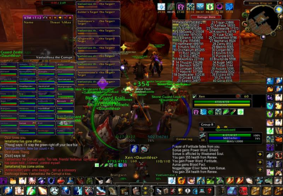
Hello and welcome to this month’s dev blog. My name is Logan and I’m in charge of everything that goes on in the UI/UX of our game, ranging from changing the starting menu of the game to the skills that you choose while in game. In this blog, I’ll be going over some of the development process of some of our UI features, as well as future plans. I’m constantly adjusting minor and major aspects of the UI so there will likely be things in here that I mention that don’t make it to the final product. With that out of the way, let’s get started. When I was but a young lad, my mother would always try to teach me how to make a proper UI for a video game. She would say things like “YOUR ICONS ARE OFF CENTER” or “HOPE YOU TOOK THE SCREEN RESOLUTION INTO ACCOUNT BEFORE MAKING THAT”. She was always pushing me to do better. She was also a nurse that had never touched a computer a day in her life so it was odd this was the hill she chose to die on. But I loved my mom so I respected her for it. She made me the UI developer that I have grown into today. Now, I know what you’re thinking. “A blog about some UI system that has been in almost every single video game that has ever come to light. BORRRRING!”. And I agree. The only people who have read this thus far are UI designers themselves, or probably bored at work. Designing and implementing a skill tree isn’t going to be as fun or rewarding as making the character shoot fireballs from their hand. But if you leave IU in your game as an afterthought, it can ruin it, or at least a part of it. When I think of bad UI, I think of an image (pictured below) from World of Warcraft that showed about 20% gameplay and 80% UI during a 40-person raid. A lot of developers sometimes refer to their code as spaghetti. This is what I would consider UI spaghetti
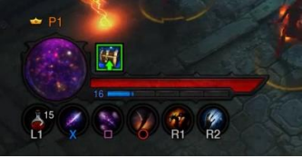
I realize that is an extreme example and the UI for that game is how you customize it, but it reflects the importance of UI design and what you want your player to see. It’s a bit like creating a web page. The information that is needed immediately should be what’s in your face. In our case, that would be Health, Stamina, and Mana. Status effects to the player should either be shown on the character itself through visual effects, or small status boxes in or beside the players HUD (similar to Diablo 3 console version, pic below). This is also a great example of a HUD that is compact and relays the necessary information to the player. The info that is not directly in front of your face as you play should be easily accessible through other means. DUNJUNGUY makes getting the info you want to see easy. All four players are (or will be) able to navigate the inventory, character stats, quests, and skill tree all at the same time using four distinct tabs. The goal is to make the information as easily readable as possible so you can go back to slaying our adorable little pug slimes.
Having all four players able to navigate onscreen will save time as other upgrade their skills and equip armor/weapons. However, there are drawbacks to this method. For one, there might be too much going onscreen that the individual player can process. The other drawback is that each player doesn’t have an entire screen to navigate. However, for our game, these two things aren’t a problem or as large of a problem. There are only 4 tabs per player with a shared inventory screen down the middle and there isn’t too much navigation going on between those tabs. The “busiest” screen you might see is if 4 players are trying to equip armor/weapons at the same time or try and rearrange their skills. Thank you for reading this month’s blog post. I hope this brought a little insight into what the DUNJUNGUY UI is striving for. The goal is again to give players the most amount of needed information in their face without having to go through too much trouble. This is something that I have not perfected but am eager to improve on as development continues. I hope you had a Merry Christmas and wish you the best this next year.
Leave a comment
Log in with itch.io to leave a comment.